I grew up in a rancher similar to the one above. Built in the early 60's, it had everything I dislike, like metal sliding windows, sliding glass doors, formica countertops and aqua colored appliances!
Who knew that I would someday want to buy a mid-century rancher and remodel it!
Better Homes and Gardens
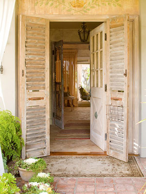
I am so inspired by the remodel of this mid-century rancher above and below. It seems that no surface was left untouched! This is the front door and entry. That door is the same door of the house I grew up in, but with the addition of shutters, it looks really cool once again!
Inside, the dining area has undergone a drastic change. The proverbial sliding glass door has been replaced with french doors. But more importantly, the floors in this house are all brick!
I think that is what really makes this house feel like a cottage and not a rancher. It probably was built on a concrete slab like a lot of homes were in the 50's and 60's.
In the living room area, it looks like all the moulding has been removed in the house and the walls are Venetian plaster.
The kitchen does not look anything like its former self! Here, the homeowner put two dressers back to back, then topped it with marble, forming an island.
The original cabinets were finished to look like wood.
The romantic master bedroom. Again, french doors replace the metal slider.
This home does not feel like the home I grew up in, but rather a very romantic cottage.
All on one level! Perfect for an aging baby boomer!
The exterior reflects a typical rancher, but hanging outdoor curtains on the posts and updating the landscaping gives this rancher lots of romance!
Traditional Home
Designers have also discovered the beauty and challenge of remodeling a typical ranch house.
Here, Barclay Butera used grasscloth on this home's entry, setting the stage for his ranch.
I love how Mr. Butera carried the grasscloth to the living room, applying it to the ceiling of all things! He put board and batten on the walls, then grasscloth above. Typically, ranch houses only have an eight and a half foot ceiling height. This idea helps alleviate that problem without raising the roof!
Here, the roof is raised! Although this photo has been around awhile, and although I'm not a blue person, I love this room! This is in no way a rancher!
Traditional Home
Sisters Laura Forbes Carlin and Alison Forbes designed a chemical free home in this mid-century rancher using low VOC furniture, paint and carpeting.
The dining room with recycled dining room table and simple and earthy decor.
The clean, white kitchen is a long way from the kitchen I grew up with!
Just for fun, here is a 1952 ranch house in northern California that I was asked to stage before it hit the market.
Offered for the first time since it was built, it is like walking into the past.
The original living room.
The original dining room with its mid-century modern furniture.
Do you think this rancher has possibilities? Could it become a quaint cottage?
I wasn't sure.
The house has a den with an original naugahyde upholstered bar!
I can only imagine the martinis that were served here. This is like a set out of Mad Men!
The kitchen with yellow and green tile is isolated from the rest of the house. Clearly, a wall would need to come down to make this house flow!
The master bedroom is a blast from the past!
The master bathroom. Can you believe the wallpaper?
The best part of this house is a little alcove with its Hollywood influenced vanity.
As I was staging this house with new landscaping and accessories, I kept wondering if it had possibilities. Could this home actually be a cute cottage, or was it destined to sell for lot value and be replaced by a new "faux chateau."
A wonderful loggia connects the living room and bedroom to the back yard. I imagined the possibilities of this space if I could do what I wanted. A chandelier for sure would hang over the table and chairs. Luckily, there was this nice painted furniture in the basement with stripe cushions waiting to be discovered.
Much of the original and over grown landscape was removed. I could imaging outdoor curtains hanging all around, framing the view to the backyard.
Maybe this home doesn't have the bones necessary to make the transition to this century; I will be curious to see what the new owners end up doing with it.
Our home in the wine country started out as a 70's rancher. It was added on to and a stone facade was added to part of it.
The house was built on a cement slab, so the floors were exposed and painted a pale sage green. The color of "the underside of an olive leaf!"
The previous owners updated the bedrooms with engineered flooring, which looks pretty authentic and also with upholstered walls. This is a great way to cover up the typical textured sheetrock of the day. The bedrooms still have the original sliding glass doors though. The only doors not replaced in the house.
The bathrooms have been updated also. Black granite counter tops with stainless steel sinks.
The windows are original sliders. Venetian plaster walls. Black slate floors.
As the baby boomers age, there will be a need for one level homes. I for one am looking forward to never climbing stairs again! The solution could very well be a 50's or 60's ranch house with really good bones, willing to be transformed into a quaint romantic cottage.
I have so many ideas for such a remodel and would love to take on the project within the near future!
Here are some ideas for updating a mid-century ranch house:
- 1. Look for a home in a nice neighborhood with a good floor plan. (The house next door to our 1906 home is a rancher.)
- 2. Replace any metal windows with new windows. If necessary, increase their size.
- 3. If possible, raise the roof in the living and/or dining room.
- 4. Address the floors. If they're concrete under carpeting, consider exposing them, like our concrete floors in our Sonoma Home, original to the 70's
- 5. Of course, remodeling the bathrooms and kitchen is probably a must!
- 6. Consider the walls. Board and batten walls will hide dated finishes.
- 7. Get rid of the popcorn ceiling! Consider tongue and groove ceilings, or Venetian plaster.
- 8. Create curb appeal with new and updated landscaping. Think boxwood hedges, white topiary rose bushes, brick or stone patios, and a killer front door.
- 9. Replace all lighting, indoors and out.
- 10. Every day, be thankful that your bedroom isn't upstairs!


